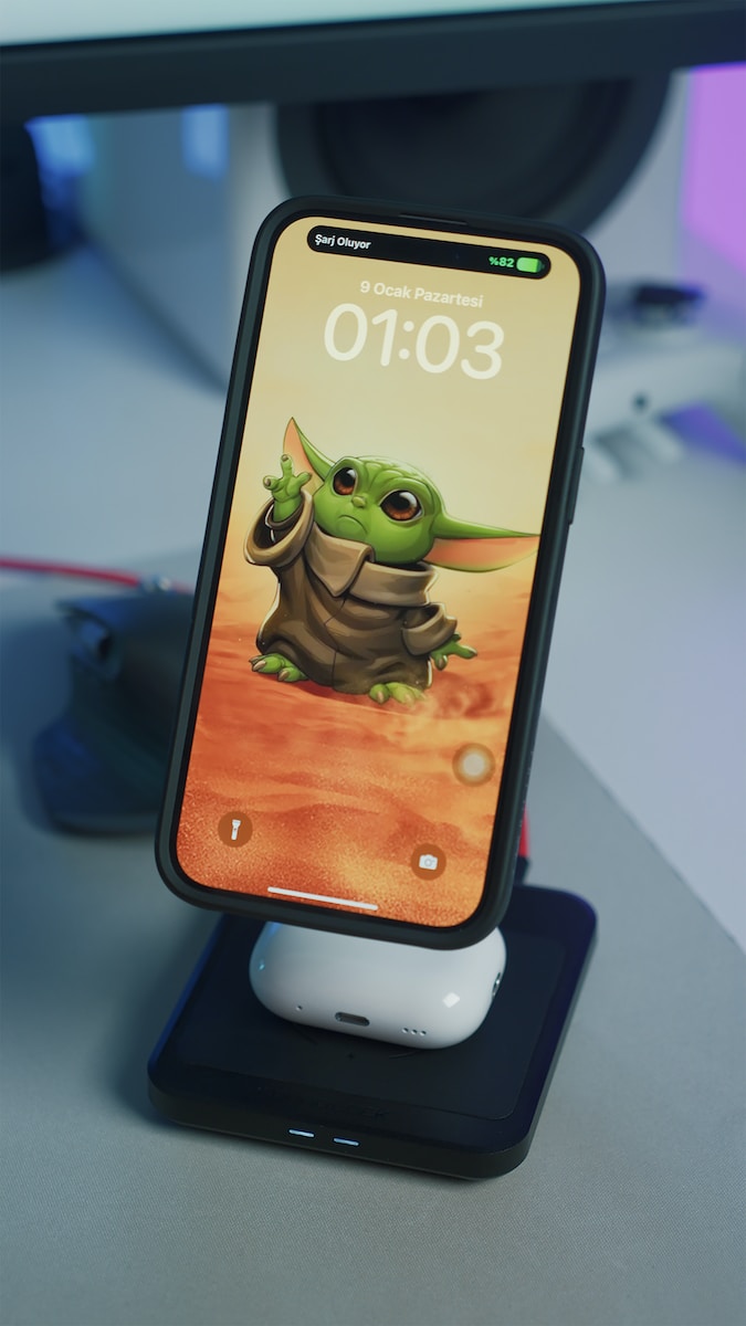
In today’s digital age, mobile devices have become the primary medium for consuming content. With the increasing popularity of smartphones and tablets, it is essential for content creators to design their mobile content with optimal readability in mind. In this article, we will explore some key principles and best practices for designing mobile content that ensures a seamless reading experience for users.
1. Keep it concise and scannable: Mobile users tend to have shorter attention spans and are more likely to skim through content. Therefore, it is crucial to present information in a concise and scannable manner. Use short paragraphs, bullet points, and subheadings to break up the text and make it easier for users to navigate through the content.
2. Use legible fonts and font sizes: The choice of fonts and font sizes can greatly impact readability on mobile devices. Opt for fonts that are easy to read, such as sans-serif fonts like Arial or Helvetica. Additionally, ensure that the font size is large enough to be comfortably read on smaller screens. A font size of at least 16 pixels is recommended for body text.
3. Prioritize content hierarchy: Establishing a clear content hierarchy is essential for guiding users through the information. Use headings and subheadings to indicate the importance and organization of the content. The use of different font sizes, bold or italicized text, and color can also help emphasize key points and make the content more scannable.
4. Optimize images and media: Visual content plays a crucial role in engaging mobile users. However, large images and videos can significantly slow down page load times and hinder the overall user experience. Optimize images by compressing them without compromising their quality. Consider using responsive images that adapt to different screen sizes and resolutions.
5. Implement responsive design: With the vast array of mobile devices available, it is vital to ensure that your content is accessible and readable across various screen sizes and orientations. Responsive design allows content to adapt and adjust to different devices seamlessly. This ensures that users can read your content comfortably, regardless of whether they are using a smartphone or a tablet.
6. Minimize distractions: Mobile screens are limited in size, so it is crucial to minimize any unnecessary distractions that may hinder readability. Avoid excessive advertisements, pop-ups, or other elements that can clutter the screen and distract users from the main content. Focus on delivering a clean and uncluttered reading experience.
7. Test and iterate: Finally, always test your mobile content on different devices and screen sizes to ensure optimal readability. User feedback and analytics can provide valuable insights into how users interact with your content. Use this feedback to iterate and improve upon your design to provide the best possible reading experience.
In conclusion, designing mobile content for optimal readability is essential in today’s mobile-centric world. By following best practices such as keeping content concise, using legible fonts, establishing content hierarchy, optimizing media, implementing responsive design, minimizing distractions, and testing your design, you can ensure that your mobile content is easily readable and engaging for users.


