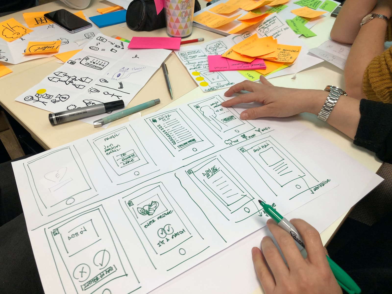
In today’s digital age, people consume content on a wide variety of devices, from smartphones and tablets to laptops and smart TVs. This presents a unique challenge for designers and developers, as they must create content that looks and functions well on all of these different devices. In this article, we will explore the challenges of designing for different devices and discuss some solutions to overcome them.
One of the biggest challenges of designing for different devices is the varying screen sizes and resolutions. A website or app that looks great on a large desktop monitor may not translate well to a small smartphone screen. Designers must consider how their content will adapt to different screen sizes and ensure that it remains visually appealing and easy to navigate across all devices.
Another challenge is the different input methods and interactions that come with different devices. For example, a touchscreen smartphone requires a different user interface than a traditional keyboard and mouse setup. Designers must consider how users will interact with their content and tailor their designs to accommodate these different input methods.
Furthermore, designers must consider the performance capabilities of different devices. A website that loads quickly on a high-speed desktop connection may struggle to load on a slower mobile network. Designers must optimize their content to ensure fast load times and smooth performance across all devices.
So, what are some solutions to these challenges? One approach is responsive design, which involves creating a single design that can adapt to different screen sizes and resolutions. This ensures that the content looks and functions well on any device, without the need for separate designs for each device.
Another solution is to prioritize content and functionality based on the device. This means that designers should consider the specific needs and behaviors of users on different devices and tailor their designs accordingly. For example, a mobile website may prioritize quick access to contact information or location services, while a desktop website may prioritize in-depth content and navigation.
Finally, designers can use performance optimization techniques to ensure that their content loads quickly and performs well on all devices. This may involve compressing images, minifying code, and utilizing caching techniques to reduce load times and improve performance.
In conclusion, designing for different devices presents a unique set of challenges for designers and developers. However, by considering screen sizes, input methods, and performance capabilities, and implementing responsive design, prioritizing content, and optimizing performance, designers can create high-quality content that looks and functions well on any device.


